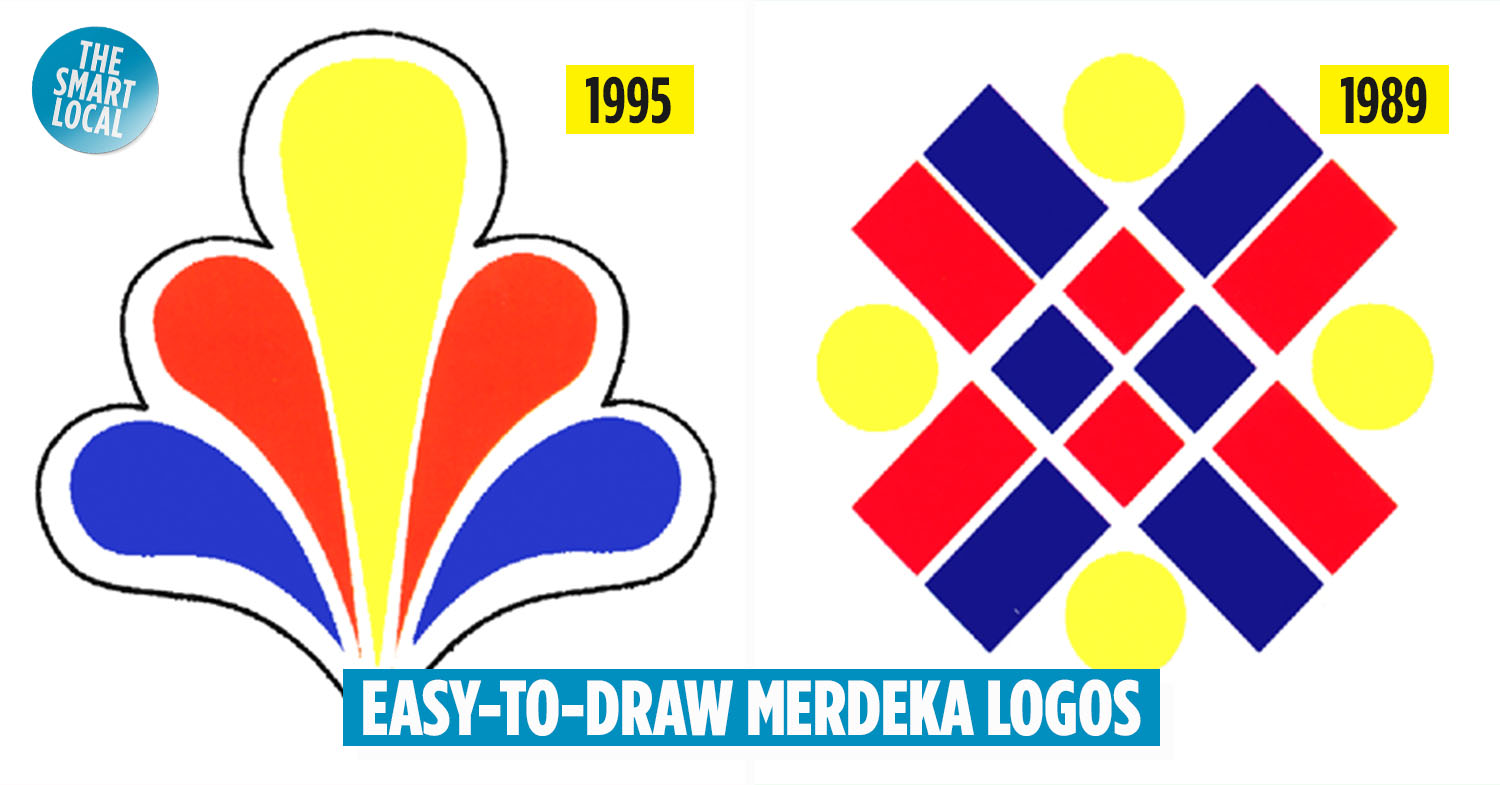
Easy-to-draw Merdeka logos
Most of us at some point in our schooling lives have had the chance to draw the national flag or the Merdeka logo and we all can relate to how difficult it can get especially with the notorious star with 14 points.
Each year, it has become a tradition for us to celebrate our Independence Day with a special theme accompanied by a logo that represents our national identity. But for many people, Keranamu Malaysia has been the most famous and memorable Merdeka theme because it was used for nearly a decade – from 2000 till 2006.
Luckily, there are other lesser-known Merdeka logos that are pretty simple that even the worst artists among us can draw them. Here are seven of them.
1. Berdisiplin Berbakti – 1980
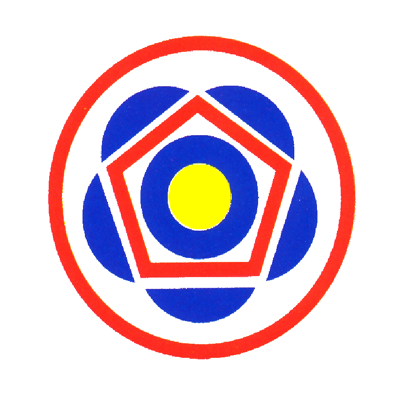
Image credit: Open University Malaysia
Berdisiplin Berbakti, or Discipline and Devotion, was the Merdeka logo from 1980. It is a relatively simple design with a mixture of geometric shapes such as circles, circle segments and pentagons.
The design may not be so easy to remember due to overlapping shapes but drawing it out can be easier because of its simplicity.
2. Bersama Ke Arah Kemajuan – 1983
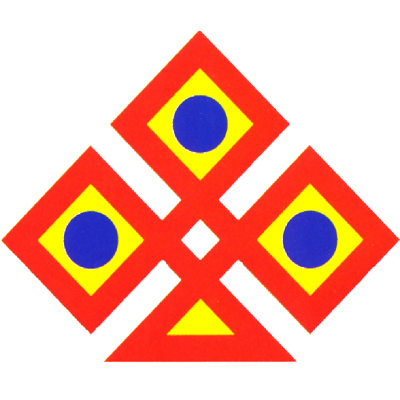
Image credit: Open University Malaysia
Bersama Ke Arah Kemajuan, or Together Towards Success, created in1983 is arguably one of the simplest logos created for Merdeka. The logo has three connected squares and a triangle as the base.
The inner yellow squares and blue circles are repeating elements. The simplicity of the logo lies in its colour arrangement – where a thick red outline surrounding the three yellow squares and one yellow triangle ties everything together.
3. Amanah Asas Kejayaan – 1984
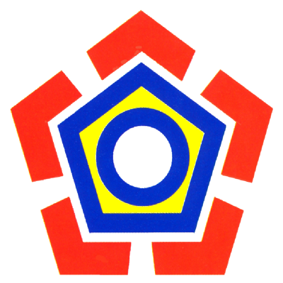
Image credit: Open University Malaysia
1984’s Amanah Asas Kejayaan, or Trust – The Foundation Of Success, has overlapping pentagons and circles in the centre and thick red arrows on every corner which can be drawn easily. The overall design is pretty simple as well, so it should be easy for most people who are attempting to draw it.
4. Setia Bersatu Berusaha Maju – 1987
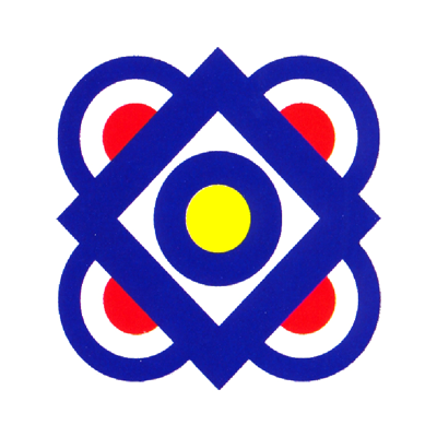
Image credit: Open University Malaysia
Setia Bersatu Berusaha Maju from 1987 certainly deserves a place in the list of simple logos for Merdeka. It has overlapping semicircles surrounding a square in the centre. Within the square, there are overlapping circles too.
The colour composition of the logo is also easy to remember because it’s mostly blue. Perhaps the one challenging thing about this logo is drawing the semicircles. But it’s definitely less challenging than drawing a star or a crescent that you generally see in other Merdeka logos.
5. Bersatu – 1989
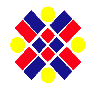
Image credit: Open University Malaysia
Just like 1983’s Merdeka logo, Bersatu, or United, from 1989 is another easy-to-draw logo for two reasons. First, it only has three shapes – circles, rectangles and squares. Second, none of the shapes is overlapping with each other.
It just requires a little bit of precision to get the logo right, especially the gaps between the shapes. The colours of the rectangles and squares have a red-and-blue pattern, and the circles are all in yellow – all of which are super easy to memorise.
6. Jatidiri Penggerak Wawasan – 1995
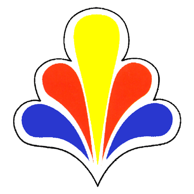
Image credit: Open University Malaysia
When it comes to logos and designs, most of us find organic shapes to be particularly difficult to remember and draw because of the level of complexity. But this Merdeka logo, Jatidiri Penggerak Wawasan, from 1995 is certainly simpler than most organically shaped logos.
The repeating left and right petals and a drop-shaped centrepiece are all there is to this logo. The black outline enclosing all the shapes is also easy to replicate.
7. Bersatu Ke Alaf Baru – 1999

Image credit: Open University Malaysia
If you’d like to draw a three-dimensional (3D) logo for Merdeka but are looking for something simple, then the Bersatu Ke Alaf Baru from 1999 is perfect for you.
The 3D effect of the logo comes exclusively from the multi-coloured cone which requires some precision to draw to create the desired effect. Other than that, this logo is still considered easy to draw because the design is simple and can be remembered easily.
Lesser-known Merdeka logos that are easier to draw than Keranamu Malaysia
As you can see, Merdeka logos in the past century were a whole lot easier to draw than what we have today. Nevertheless, we truly appreciate the creativity of designers who come up with interesting designs each year for Merdeka.
We hope this list will be helpful for you to be more familiar with Merdeka themes and logos from previous years that have certainly paved the way for today’s modern designs.
Read more related Merdeka stories here:
- Malaysian’s Merdeka-themed photo using lights
- 8 popular Merdeka Day songs that most 90s kids know and love
- 11 Mokhtar Dahari facts every millennial should know
Cover image adapted from: Open University Malaysia and Open University Malaysia
